Essentials Hero
Build rich hero/banner experiences with layout, tile and media controls.
Configuration Guide
- Add the Essentials Hero web part to the page.
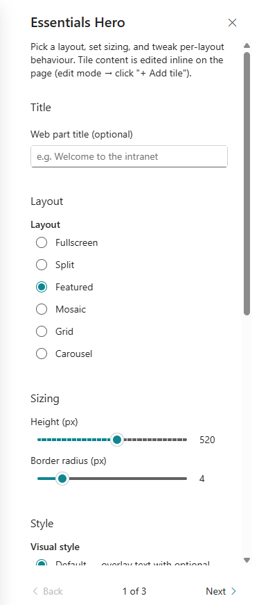
- Choose the hero layout: fullscreen, split, featured, mosaic, grid, or carousel.
- Set the hero height and border radius.
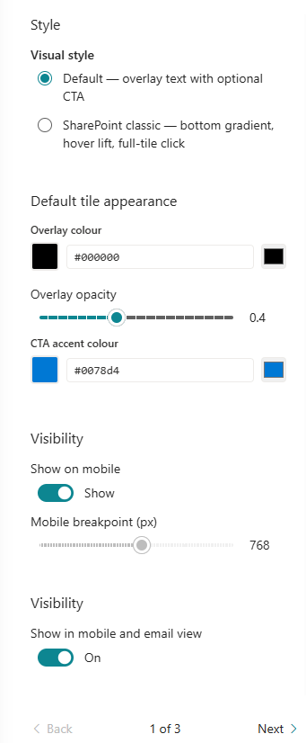
- Configure visual style, overlay colour, overlay opacity, and CTA accent colour.
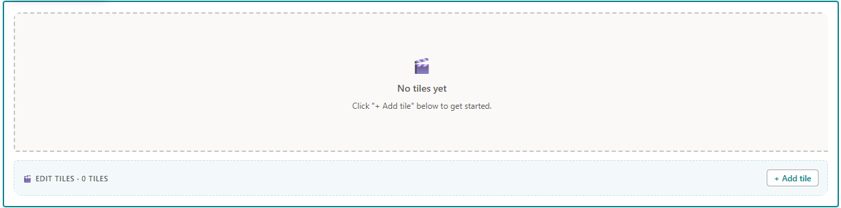
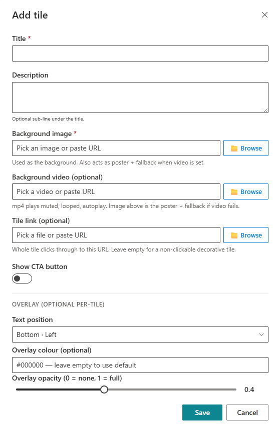
- Add tiles and set title, description, background image, optional background video, and tile link.
- Configure text position and overlay settings for each tile.
- Enable or disable display on mobile, set the mobile breakpoint, and configure mobile/email visibility.
Key Features Configuration
| Feature | Description | Configuration |
|---|---|---|
| Layouts | Choose the overall hero arrangement | Fullscreen, Split, Featured, Mosaic, Grid, Carousel |
| Hero sizing | Control height and corner rounding | Height and border radius controls |
| Overlay styling | Adjust colour tint and transparency | Colour and opacity settings |
| CTA accent | Set the call-to-action button colour | Button accent colour |
| Tile media | Add background images or videos per tile | Image and optional video backgrounds |
| Mobile support | Toggle mobile display and set breakpoint | Show on mobile toggle and breakpoint |
Property Pane Options
| Option | Type | Description |
|---|---|---|
| Layout | Dropdown | Select hero layout |
| Height | Slider / Number | Set hero height in pixels |
| Border radius | Slider / Number | Set corner radius in pixels |
| Visual style | Radio | Choose default or classic visual style |
| Overlay colour | Colour picker | Set default overlay colour |
| Overlay opacity | Slider | Set overlay transparency |
| CTA accent colour | Colour picker | Set button accent colour |
| Show on mobile | Toggle | Enable hero on mobile |
| Mobile breakpoint | Slider / Number | Set mobile width threshold |
| Show in mobile/email view | Toggle | Enable or disable in mobile/email |
| Tiles | Collection editor | Manage tile items and links |
Illustration