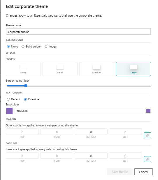
Essentials Theme
Preview theme palettes and token-driven styling for SharePoint pages.
Configuration Guide
- Add the Theme web part to the page.
- Choose the palette or theme variant to preview.
- Configure colours, fonts, and component tokens.
- Adjust preview settings and visual examples.
- Verify the theme preview reflects selected palette settings.
Key Features Configuration
| Feature | Description | Configuration |
|---|---|---|
| Palette preview | View the full colour palette | Show theme colour palette |
| Token styling | Configure design tokens for components | Configure theme tokens |
| Font settings | Select typefaces and font tokens | Choose font styles or tokens |
| Preview examples | See sample components with the theme applied | View sample styled components |
Property Pane Options
| Option | Type | Description |
|---|---|---|
| Palette | Dropdown | Select theme palette |
| Colours | Colour picker | Configure primary/secondary colours |
| Fonts | Dropdown | Select font tokens |
| Preview | Toggle | Show live theme preview |
Illustration